

Western Union: Customizable Reports
UX Research, Strategy and High Fidelity Design
Overview
Team: Colleen Keegan (Product Designer), Esteban Santizo (Product Manager)
My Role: Senior UX/UI Designer, UX Researcher, Strategist
Tools: Figma
Timeline: September-October 2025, January 2026
Background
As Western Union’s primary administrative platform for retail agents, the Retail Service Portal (RSP) acts as the administrative heart of the retail agents core software, along with systems like Western Union Point of Sale (WUPOS) and Retail Money Order (RMO). Despite its central role in managing agent operations, platform adoption remained low due to a complex and confusing user interface.
Reporting on agent earnings was a primary point of friction. The legacy system gave agents minimal control and zero visibility into system constraints. Users routinely ran into system errors by choosing unsupported date ranges, as the interface offered no guidance on data limits. Essential earnings metrics were missing entirely, and the system failed to display selected criteria or active filters. As a result, agents were forced to generate multiple reports through trial and error just to verify their data.

Goals
The Clients
Western Union’s extensive global retail network relies on independent business partners, agents, and operators to execute daily financial transactions. These B2B retail users manage high volume money transfers, money orders, and point of sale operations across thousands of physical locations.
The Journey
The primary objective was to empower retail partners with direct, flexible control over their earnings data and report structures. To achieve this, the project set out to eliminate user guesswork by introducing clear visual parameters around date ranges and active selections, directly preventing system errors and stopping the cycle of repetitive report generations. Ultimately, by streamlining the reporting workflow within RSP, the goal was to build agent trust, ease daily operational frustration, and drive measurable platform adoption.
The Role
As the product designer leading this initiative, I was responsible for end to end UX research, workflow architecture, and interface design within the Retail Service Portal (RSP). Working within a specialized B2B environment with a unique agent user base, I collaborated closely with engineering teams and business stakeholders to turn complex financial reporting requirements into an intuitive, self serve product experience.
Research
Understanding Existing Reporting
One of our primary goals was to understand why adoption for the existing RSP reporting platform was so low. Through user interviews and observational sessions, the core problem became obvious quickly: the system was simply too confusing to be useful.
Instead of helping users make sense of their financial data, the tool overwhelmed them with rigid, cluttered outputs. Most people actively avoided using the platform altogether, resorting to manual workarounds just to get the numbers they needed.
Key Insights
High Cognitive Load: The legacy reports presented data in a dense, one size fits all format that did not align with how different roles actually consumed financial information.
Low Platform Trust: Because the data was difficult to interpret and navigate, users lacked confidence in the generated figures and abandoned the tool.
The Need for Autonomy: Users did not just want cleaner visual design; they needed granular control over what metrics they saw, how those metrics were organized, and when they were delivered.
The Strategic Pivot
These findings shifted our focus from simply redesigning the existing templates to building a fully customizable reporting engine. By putting users in direct control of their financial views, we aimed to eliminate ambiguity, rebuild trust in the platform, and deliver actionable data tailored to each user's specific workflow.
User Feedback
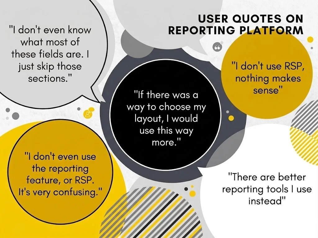
Because overall platform adoption was low, we focused our efforts on deep dive interviews with the few active users we could reach. These conversations revealed a critical behavioral pattern: users were actively ignoring large portions of the system simply because the terminology and configuration options made no sense to them.
Rather than exploring the tool to see what it could do, users played it safe. They defaulted to a handful of familiar inputs, generated incomplete reports, and disregarded everything else on the screen.
Key Discoveries from User Interviews
Fear of the Unknown: Jargon heavy labels and unclear configuration settings created hesitation. Users worried that selecting unfamiliar options would break the report or generate inaccurate financial figures.
Feature Blindness: High value metrics and deeper analysis tools went completely unused because their purpose was never clearly explained within the interface.
Fragmented Workflows: Because users only pulled partial data they felt comfortable with, they had to manually piece together the missing context in external spreadsheets afterward.
The Design Takeaway
This feedback made it clear that visual customization was only half the battle. We also needed plain language labeling, contextual tooltips, and guided defaults so users would feel confident exploring and utilizing the full scope of their financial data.
Competitive Analysis
To solve our customization problem, we looked beyond direct financial tools and analyzed how everyday, data heavy platforms handle complex organization at scale. We specifically studied platforms like Salesforce, Gmail, and various modern administrative tools to see how they empower users to manipulate large volumes of information without feeling overwhelmed.
What We Learned from the Market
Salesforce (Modular Customization): Salesforce excels at letting administrators drag, drop, and rearrange dashboard components. It showed us the value of treating data blocks as modular widgets that users can stack and prioritize based on their daily needs.
Gmail (Progressive Disclosure & Filtering): Gmail handles massive amounts of incoming information cleanly through customizable views, quick filters, and density controls. We saw how giving users simple, visible controls to filter noise makes a high volume system feel lightweight and approachable.
Administrative Tools (Preset Templates with Editability): The best enterprise tools we evaluated did not force users to build from scratch. Instead, they provided solid default layouts that users could tweak, reorder, and save as personal presets.
Applying the Patterns
Rather than reinventing common interaction patterns, we adapted proven conventions from these platforms. The goal was to give our users familiar mental models for reordering columns, filtering metrics, and saving custom layouts. This reduced the learning curve and ensured our financial tool felt intuitive from day one.
Ideate
Armed with a clear understanding of user friction and feature hesitation, our team broke down the problem into manageable design challenges. We explored multiple concepts for modular layouts, progressive disclosure, and intuitive filtering, setting the stage for a customizable reporting system that felt approachable rather than intimidating.
Information Architecture
Our primary structural challenge was turning an intimidating, endless list into an intuitive mental model. We conducted card sorting exercises with active users to understand how they naturally categorized financial metrics, grouped calculations, and prioritized data points during their daily routines.
Using these insights, we broke the massive pool of fields into logical, high-level buckets like Account Details, Transaction History, Fee Summaries, and Performance Metrics. Within each bucket, we established a clear visual hierarchy with collapsible sections, search functionality, and smart tags. This structured categorization allowed users to quickly zero in on relevant sections without having to scroll through dozens of unrelated options.
Design
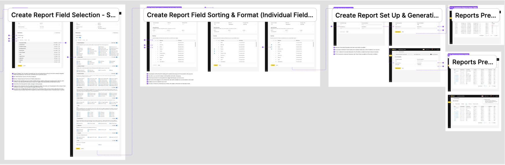
High Fidelity Designs
For the final high fidelity designs, we paired a refined design system with intuitive interaction details. Real financial data, clear typography, and thoughtful contrast helped transform a formerly intimidating tool into a modern, trustworthy workspace.
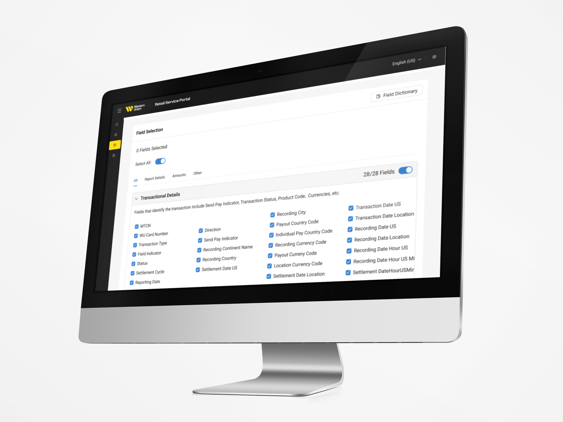
Field Selection
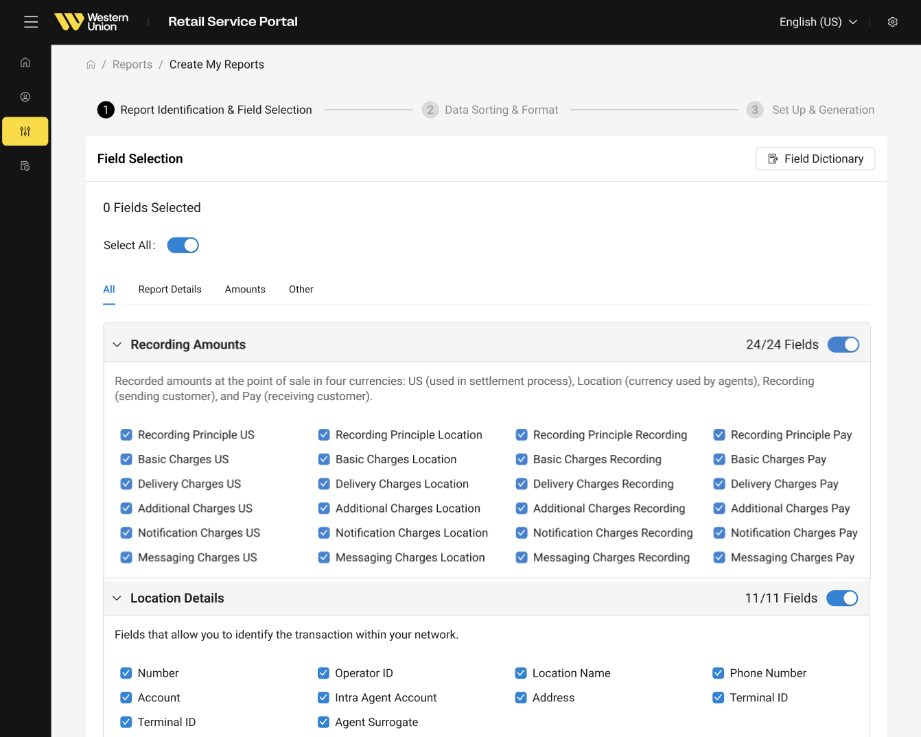
Handling 134 individual selections was our biggest design challenge. We had to find the sweet spot between information overload and oversimplifying the screen to the point of confusion. We focused heavily on visual hierarchy and progressive disclosure to keep the selection process smooth and intuitive.
Multi-Select Capabilities
Total flexibility was essential. Even with 134 fields to navigate, users needed the freedom to pull any combination of data they wanted. To prevent selection fatigue, we designed bulk actions, grouped categories, and intuitive multi-select controls that made curating large sets of data fast and straightforward.
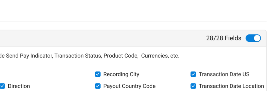
Toggle Sections
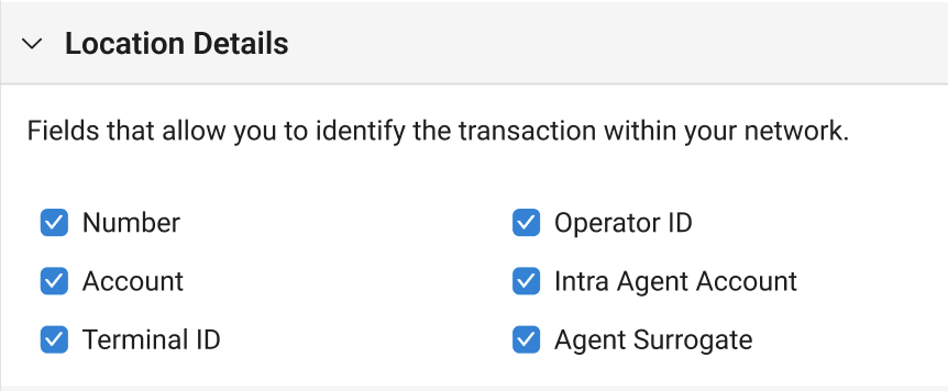
Since there were 134 fields to choose from, we wanted to gibe users the ability to do larger swaths of selections. We added toggles to each section, which allowed for users to select everything in that section at once.
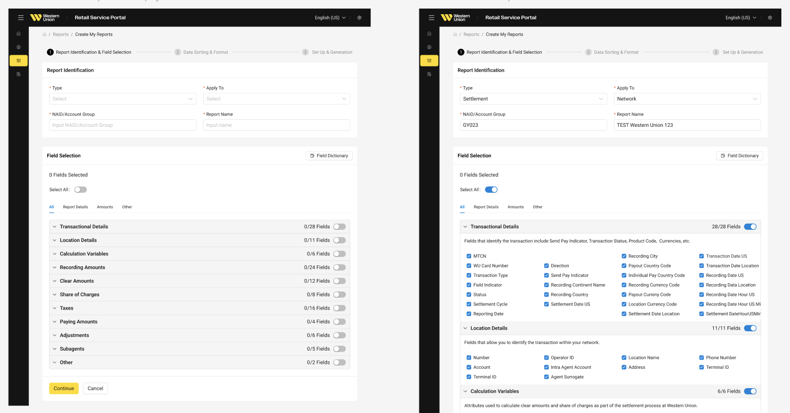
Progressive Disclosure
Because of the high level of data, we wanted to make the information more digestible and organized. We made the sections closed by default, then opened when all the required selections were made above with everything preselected.
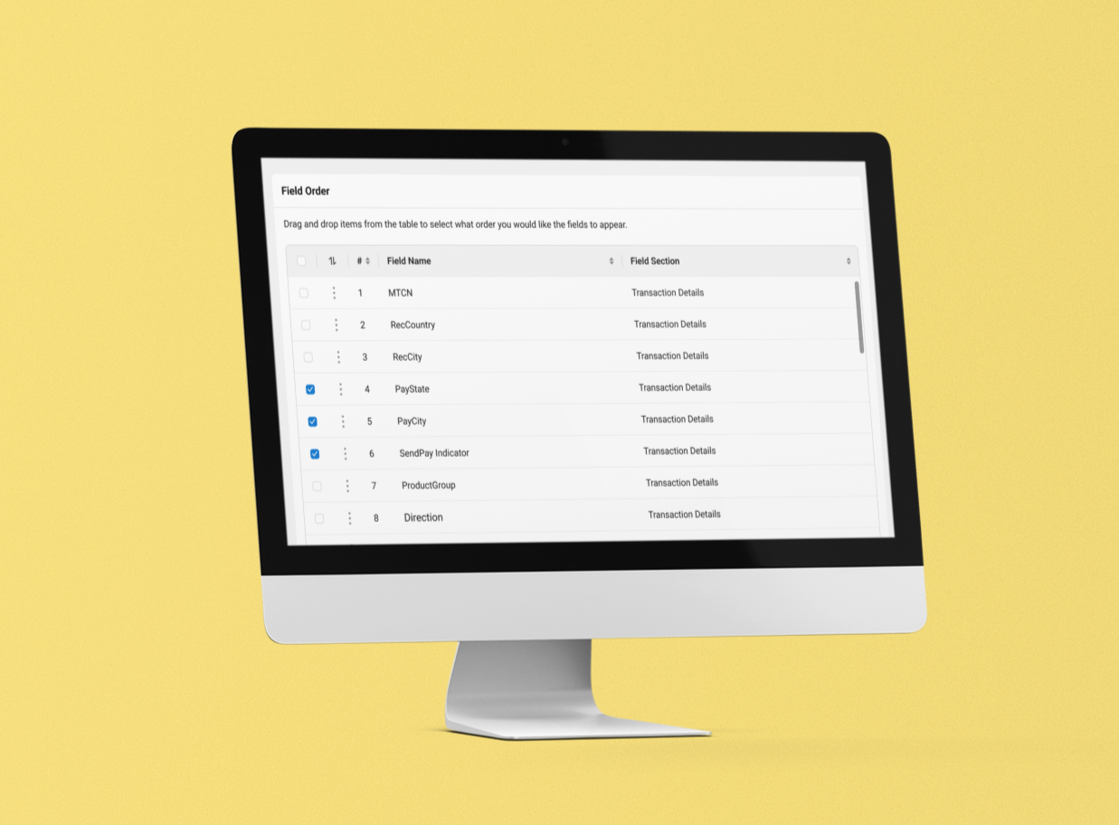
Field Sorting
To help users make sense of confusing financial terminology, we designed an integrated field dictionary directly into the reporting tool. Instead of forcing users to rely on external documentation or guess what unfamiliar labels meant, hovering over or selecting any of the 134 options revealed clear, plain-language definitions and context.
This upfront transparency removed the guesswork from the configuration process. By giving users immediate insight into what data each field pulled, we helped eliminate the "ignore what you don't know" behavior, giving them the confidence to explore new metrics and build more accurate reports.
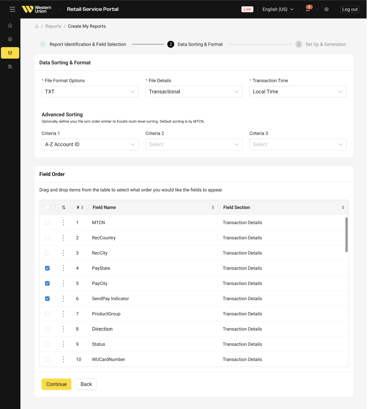
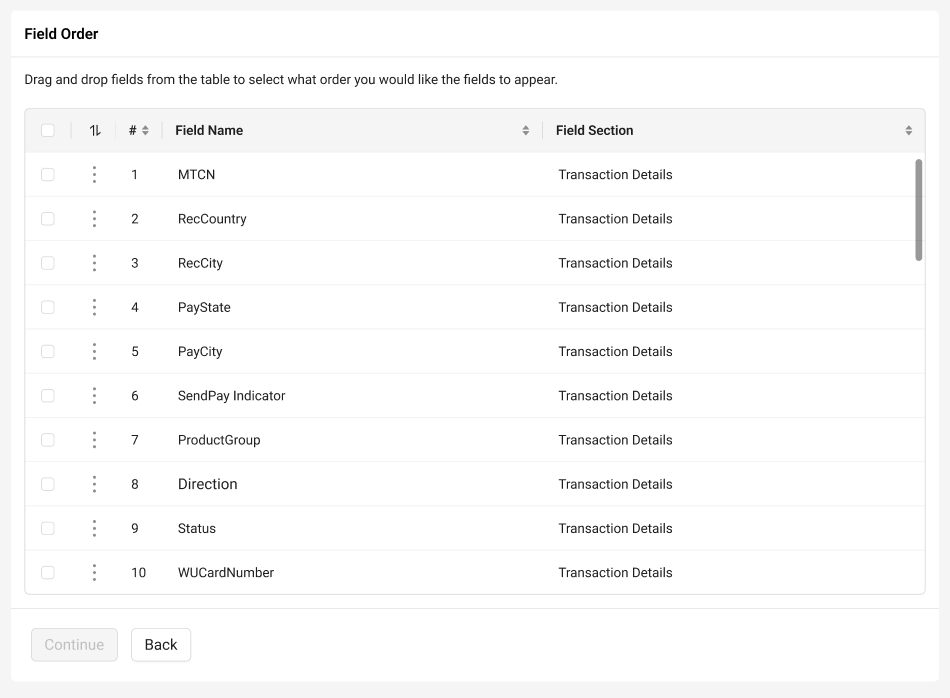
Multi-Select & Bulk Actions
Just like managing emails in an inbox, users could select multiple checkboxes across different categories using click shortcuts or a quick "select all" action within any bucket.
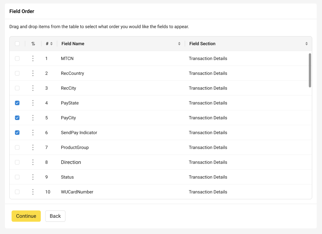
Unified Drag & Drop
Once items were checked, clicking and dragging any single selected field picked up the entire bundle together. A subtle count badge followed the cursor to show exactly how many fields were being moved simultaneously.
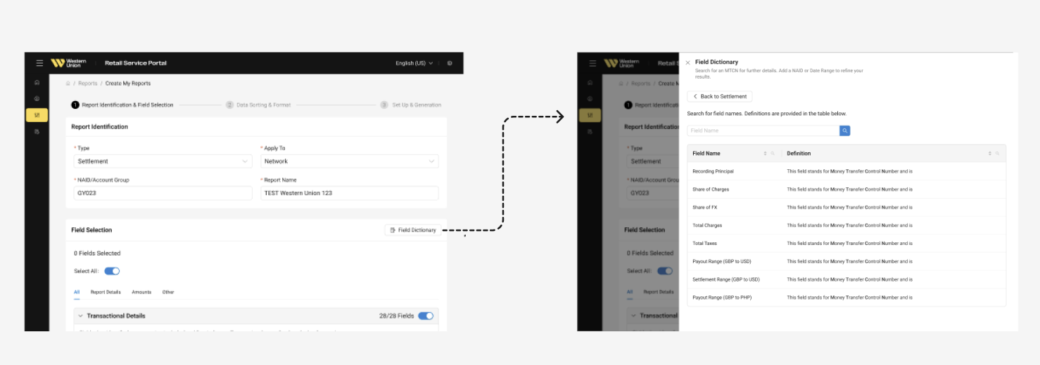
Field Dictionary
To help users make sense of confusing financial terminology, we designed an integrated field dictionary directly into the reporting tool. Instead of forcing users to rely on external documentation or guess what unfamiliar labels meant, hovering over or selecting any of the 134 options revealed clear, plain-language definitions and context.
This upfront transparency removed the guesswork from the configuration process. By giving users immediate insight into what data each field pulled, we helped eliminate the "ignore what you don't know" behavior, giving them the confidence to explore new metrics and build more accurate reports.
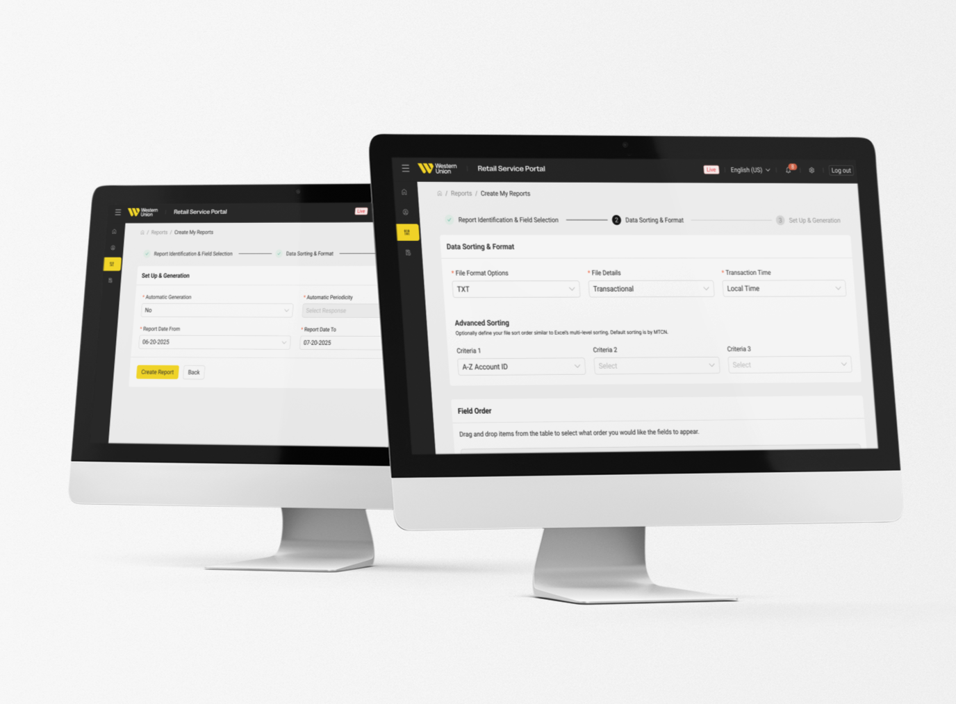
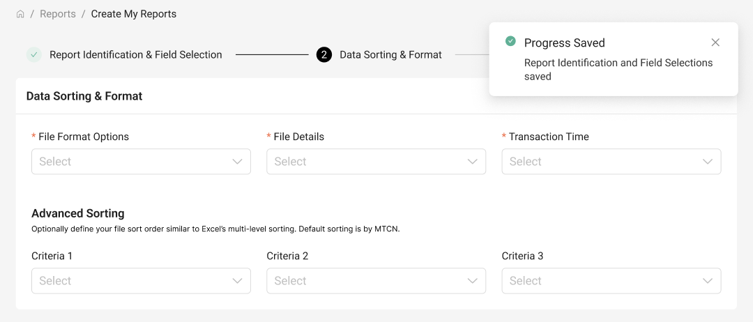
Stepper Progress
Because building a custom report takes real focus, we designed the workflow to be completely flexible and non linear. Users could click directly on any step in the process to jump back and tweak previous choices without losing their place or having to start over. This allowed people to experiment with different data configurations on their own terms.
To build trust and eliminate hesitation, every change automatically saved in real time. We paired this with visible "Progress Saved" status indicators at every stage, giving users the peace of mind that their hard work was safe even if they stepped away or changed their minds mid flow.
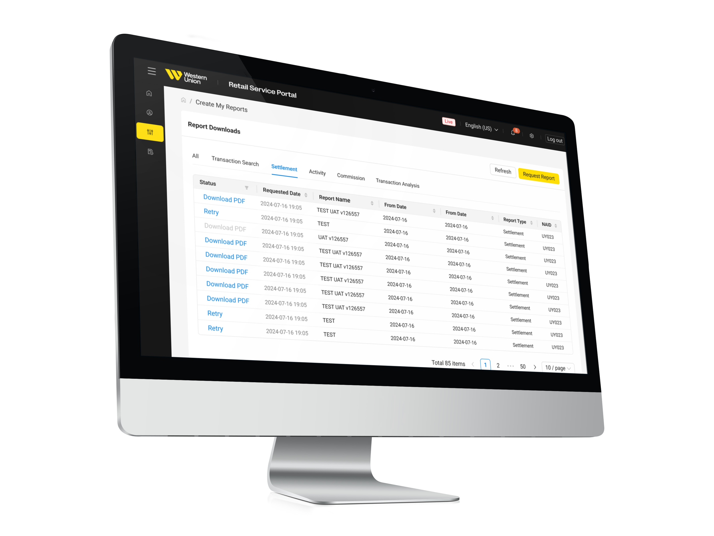
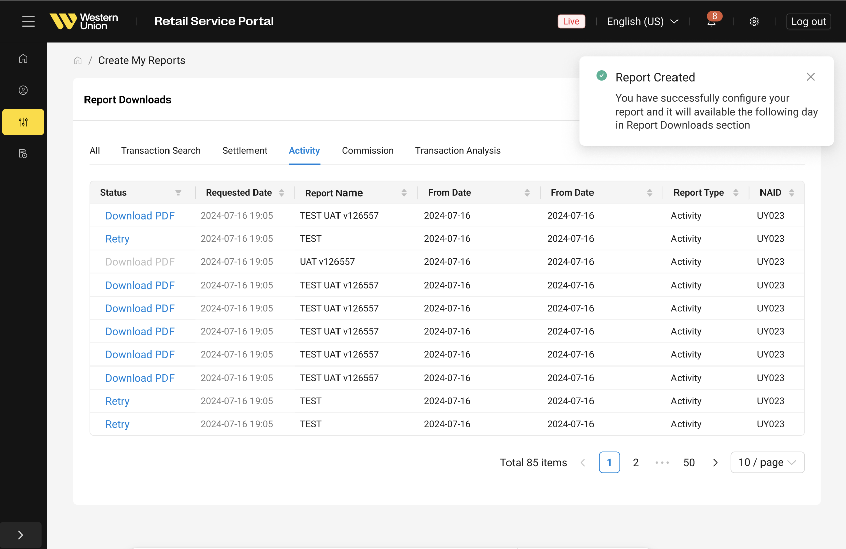
Downloads Table
To give users full visibility into their generated files, we designed a dedicated downloads table. The view clearly organized real-time statuses, letting users see at a glance which heavy data pulls were still in progress in the background and which were finished and ready for review.
The table also acted as a complete archive for past reports, eliminating the frustration of hunting down historical data. With simple sorting, filtering, and direct one-click PDF downloads, users could quickly grab formatted spreadsheets straight into their existing accounting workflows.
Next Steps
The launch of the customizable builder laid a strong foundation, but it was just the first step in overhauling the reporting experience. For Phase 2, our roadmap focused on deeper research and expanding the product ecosystem to create an even more seamless workflow.
Key Next Steps
Expanding the Research Pool: We planned to recruit a broader network of external agents and power users for ongoing usability testing. Gathering real world feedback from a wider variety of roles would help us uncover edge cases and refine the multi-select tools further.
Transitioning to a Dedicated Reporting App: Long term, our vision was to migrate these capabilities out of the legacy RSP environment entirely. We began architectural planning for an independent, comprehensive reporting application that would centralize this custom builder alongside other core analytics tools in one unified workspace.
Report Template Recommendations: With more agent input, we aimed to introduce smart presets and AI assisted report suggestions tailored to specific job functions, cutting down setup time even more.